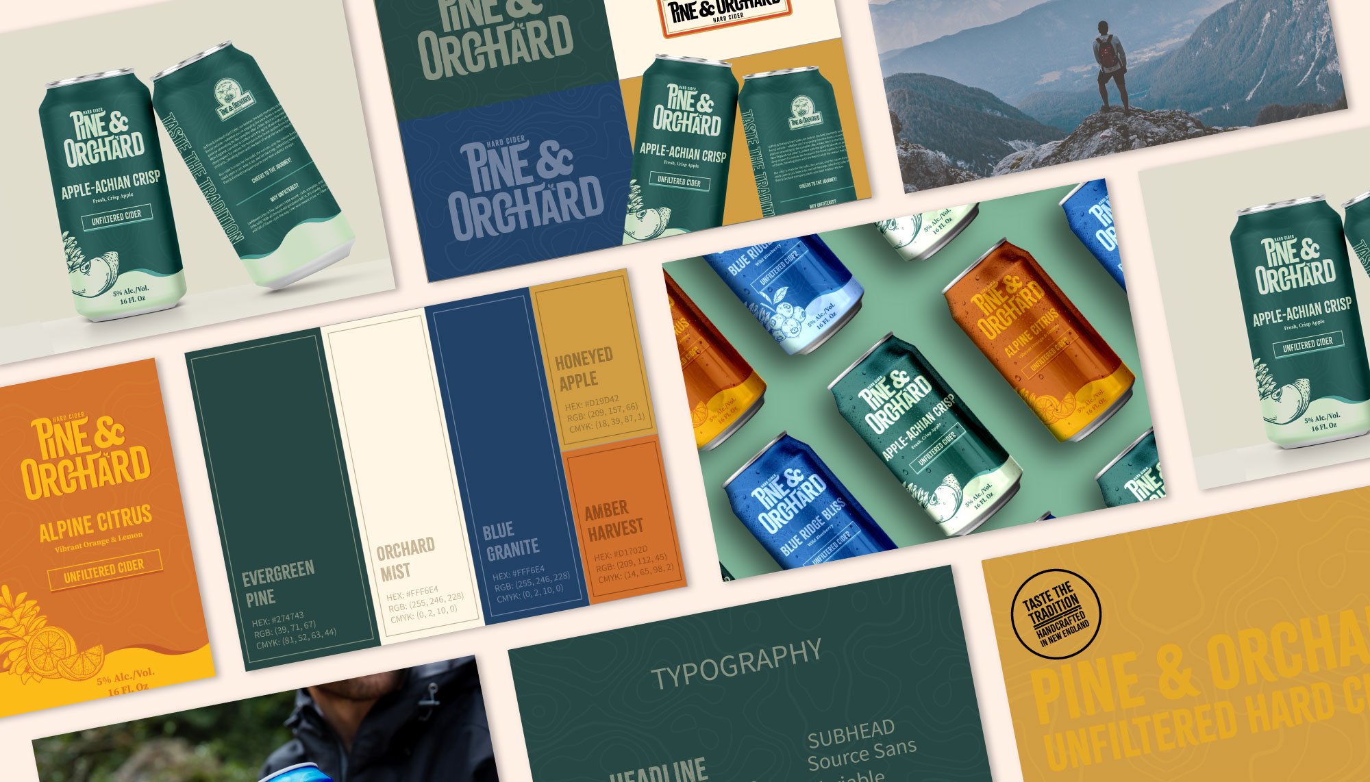
Pine & Orchard’s journey into the hard cider market was an opportunity to create a brand that truly reflects the rugged charm and deep-rooted tradition of New England.
At its core, Pine & Orchard is about celebrating the simple pleasures: crisp, handpicked apples, breathtaking hikes, and the warmth of a fireside drink. Yet, their previous branding didn’t quite capture the outdoorsy, authentic spirit behind their tagline,
“Taste the Tradition.”
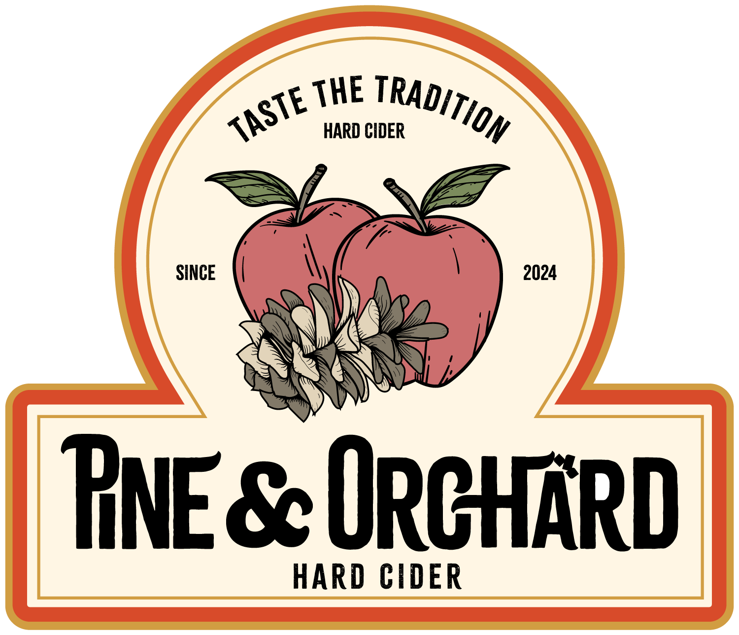
This collaboration was more than just designing a logo—it was about weaving Pine & Orchard’s story into every visual element, from the logo to the can packaging.
The result is a brand identity that’s bold yet grounded, blending rustic elegance with the adventurous soul of the outdoors. The designs evoke the crisp air of mountain peaks and the comforting glow of a campfire, creating a memorable connection for cider lovers who crave tradition with a modern twist.
A Brand Identity Based On Tradition.
Brand Identity:
Rustic, adventurous, authentic, timeless, bold, grounded.
Keywords:
Warm, inviting, heritage-forward, down-to-earth.
Deliverables:
Logo suite, brand illustrations, label design, brand colors, brand identity guidelines, and typography.


